How to Choose Fabrics for a Two Color Quilt
Two color quilts are made of a design and and a background. Therefore, they rely on stark contrast more than any other quilt we make. Let’s discuss several pairings to create the effective contrast needed for these types of projects.
(This post contains affiliate links)
Because the only way a design “pops” from the background is for there to be contrast between the two, two color quilts are often the most “punch you in the face,” like red and white quilts or blue and white quilts. There are other ways, as we know, to create contrast, though, so let’s revisit the same types of contrast we discussed last week.
If you missed the All about Contrast post, be sure to check it out here!
Video
I used to think two color quilts were boring-- then I realized they're an amazing opportunity to take something "simple" and make it STUNNING! This video was originally filmed on Facebook Live.
Value
Value is the saturation of color, also known as how light or dark a color is. To create a high-value contrast quilt, we need a very light color and another much deeper color.
This pink and white fabric pull, of course, is a variation of the classic red and white quilt. I’ve leaned more pink, and I’ve pulled prints, but the basic concept of strong light/dark contrast is the same. There are a few important things to note about the prints: first, the color of the print (Team Background vs. Team Pink) is determined by the color of the fabric itself, not the design or images printed on it. Second, I used the prints of both fabrics to “tie up” the white/pink theme with white designs on several of the pink fabrics and vice versa. Choosing neutral or background prints that have bits of the main color in them always adds visual coherence. It’s not “required,” but your brain will subconsciously notice and like it.
Finally, I also varied the scale of the prints I chose (some are total, some are novelty, etc). Because of that, if I chop up these prints and one piece is dominated by a tree or a camper or the yellow center of the large Alison Glass print, I may need to avoid using those pieces if it becomes unclear whether they are “Team Background” or “Team Pink” as a result. Again, just paying attention to how the fabric cuts and being willing to avoid certain pieces helps prevent your quilt from getting “muddy” or confusing visually in spots. With most quilts, you’ll be looking to create a “range” of light-dark values. But if you are using value for contrast in a two color quilt, remember that you will need a CLEAR light and dark next two each other.
Color
If color is the primary source of contrast in your quilt, many of the fabrics may have similar value. The result will be striking, saturated quilt.
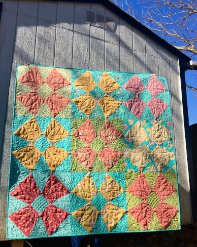
I get asked about blue and yellow quilts a lot because it’s a combination we all love, but that can seem confusing since blue and yellow are not complements. Often, if two colors of similar value are set in contrast, the quilt relies on the complementary nature of the colors to create the contrast. Here, blue and yellow sit as part of a triad (blue-yellow-red) on the color wheel, not as opposites. However, blue and yellow do have a strong warm cool contrast, and it is a contrast we see often in the natural world (blue sky and sunshine, a cold lake surrounded by yellow flowers) and in our lives (the swimming pool and lemonade). It’s a contrast of color significance, but also of psychological significance. As a little extra, notice that I chose several yellow prints with hints of red. This pulls on the blue-yellow-red triad I mentioned earlier to add another subtle visual “pop” to a limited color palette.
This original version of my Dogwood Blossoms Quilt also used color contrast to separate the background and the design. Red and blue are like blue and yellow— part of a triad but forming contrast by temperature (warm/cool). Other blocks on this quilt are red/green— which is both a warm/cool contrast and a complementary colors contrast. Note that this quilt has little value contrast and little scale contrast (all of the prints are pretty close in size). That makes this quilt more gentle than some of my usual “punch you in the face” choices, but still visually interesting.
Scale
Of course, the starkest contrast of scale is a solid and a print, but you could also create this effect with a small or tonal print against a large, “loud” print. Notice, too, that I added the warm/cool contrast with this choice. Then, in the right hand picture, the darker navy solid adds value contrast as well.
As demonstrated, we are mistaken if we think that a “two color quilt” has to be visually predictable, boring, or simple. On the contrary, we can utilize and create amazing contrast with our fabric choices to make even “minimal” quilts absolutely stunning!


