
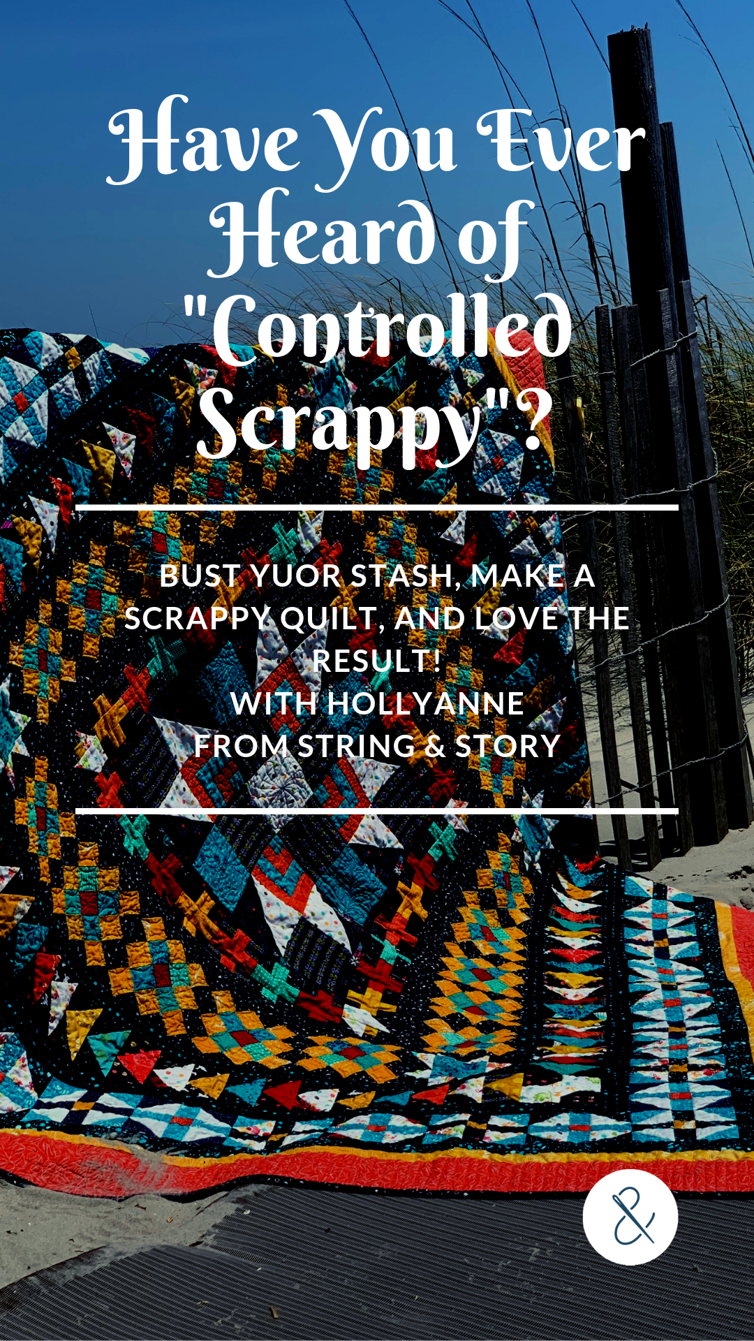
How to Make Any Quilt Pattern Scrappy (and love it!)
Sometimes, you want to make a quilt, but you're a little short on the yardage. Or maybe you have a pile of fat quarters or scraps that you want to use up. How can you be sure that all those prints will "play nice" and create a finished quilt you love? Have no fear-- I'm OBSESSED with scrappy quilts, and I'm here to tell you my "secrets"!
PS This post is part of the Summer Stash Busting Challenge-- Welcome! Be sure to check out the original post to see the full lineup of content here.
(This post contains affiliate links)
One of the top questions I've received as we have been simultaneously stash busting and doing a quilt-a-long has been about what to do if you are a bit short on yardage for a project. My solution, almost every time, is to make a scrappy quilt! I'm learning, though, that my apparent "wild abandon" with making a scrappy quilt makes some of you very anxious. You want to make lovely scrappy quilts, but you also want to know that the quilt will turn out pretty. You'll be quite pleased to know, then, that I have several guiding principles when choosing fabrics to include in a scrappy quilt.
Key Elements of a Successful Scrappy Quilt

Consider Scale
First, about the scale of the piecing. If your quilt has large pieces, the print of each fabric is going to show a lot more. If you have a set of gorgeous focal prints, this can be ideal-- you can show off the fabrics. This works especially well with a coordinated prints like a pre-curated fat quarter bundle where you know all the designs go together. The down side to large prints and large piecing is that they fabrics themselves can be distracting from the piecing. If you are piecing large with prints, be prepared for the fabric to steal the show!

(Above: For both of my versions of Dogwood Blossoms, I used prints that stole the show. Cut too small, they would be tricky to categorize to any one color, plus the art of them is so gorgeous. Thus, I left them big and let them shine)
Another thing to keep in mind about large scale prints is that they often have a lot of colors. Thus, if you are cutting them up to more "traditional patchwork" sizes (think about 3"), then one square might be pink but another of the same fabric might be green or blue. Use these fabrics according to what they look like cut up, not according to the whole piece of fabric.

Contrast
Contrast is valuable in any quilt, and it has been very trendy lately to talk about light-dark contrast (taking a picture of your quilt on your phone, making it black and white, etc). This is a great practice and a great type of contrast, but it is not the only contrast you can utilize in a quilt. Types of contrast include:
Value (Light/Dark)
Warm/ Cool Colors
Complementary Colors (ex: blue and orange)
Prints/ Solids


Color Palette
Creating a strong color palette, and being vigilant that all pieces fit the palette, creates a strong quilt. It's very common to see quilt patterns calling for 3 or 5 colors. If three, I recommend a dark, medium, and light-- even if all three are different colors. What I mean by that is that creating an triadic color palette (like red, yellow, blue) would not be a powerful enough contrast in this context. You would also want value contrast for a really punchy quilt (If you want a less punchy quilt, color contrast alone with little value contrast is fine-- see the warm and cool Dogwood Blossoms Quilt below).

For a five color quilt, I generally pull a light neutral, a dark neutral, and three rich colors with medium value. Most recently, I chose colors for the Camp Oda May Choose Your Own Adventure QAL over at the Moda Bakeshop. My neutrals are white and navy, and I chose mustard, red orange, and aqua for my three colors. Everything about this quilt is rich and saturated.
If you can create a strong color palette and stick to it, then your scrappy quilt will succeed. The hardest part is sticking.to.the.palette. Varying too far from your chosen colors just to make some bit of fabric "work" or to get it used up will turn your colors to mud. Stay true to your chosen colors, pay attention to what bits of things look like cut up, and you're quilt will be gorgeous!
Lots of Examples


Lanterns of Hope
Lanterns of Hope is a six color quilt with a strong color story (the color is really what makes this pattern). Basically what that means is that you want some great contrast between your lightest and darkest colors to get the "wash" effect with some zingy transition colors in the middle. My original version is shown here on the left in all solids, and on the right is my current version in progress, which is much, much scrappier. Lydia's quilts (center) use varying amounts of scrappiness and lots and lots of color play (especially that center quilt which uses warm/ cool play).


Perfect Fit
Perfect Fit has an equally strong color story as Lanterns of Hope but with half the number of colors. This quilt is all about stark contrasts-- light/ dark, warm/cool, even solids/prints. My quilt (far left) is all about value contrast. Indigo (center) used warm/cool contrasts as well as print solid contrasts. The pieced strips could have gotten "lost" except that she used that bright white to highlight the L shape of the piecing. Carolyn (far right) has less value contrast, but uses a gentle warm/cool play with the bright white to create a gentler, yet still dynamic quilt.


Dogwood Blossoms
This quilt has big piecing for big prints. On the left, I used warm/cool contrast but without a lot of value contrast to create a quilt with bold piecing but a gentle, cozy aesthetic. On the right, those big, bold prints just about jump out and punch you in the face from that orange background. Not only does this demonstrate the power of a non-neutral "neutral," but it demonstrates the versatility a single pattern can hold.


Mystery Quilts
"This is all well and good, HollyAnne, but what I really struggle with, is when I want to do a mystery QAL." I hear ya, friend! Sometimes suggested colors are included, and sometimes not-- and what if you don't like the colors suggested?? Remember I mentioned above that 3 or 5 colors is common? When in doubt, do that (Though Bonnie Hunter's En Provence, in the center, technically has six, but the green and aqua I used are very similar). Above you'll see my version of the Moda Bakeshop Choose Your Own Adventure QAL quilt on the far left and my friend Kristin Esser's on the far right. I used 5 colors (light, dark, three punch mid-tones) for a very bold quilt, and Kristin is using three gentler colors-- light and dark neutral and a color (or a light color, dark color, and a neutral, depending on how you want to look at it). Both are creating great contrast and beautiful quilts, but to very different effect. For a fuller explanation of how I look at colors for mystery quilts and some guiding principles of color, check out my blog post Choosing Colors for En Provence.

PS Don't forget to pin this post so you can find it later!
This post is part of the Summer Stash Busting Challenge-- Welcome! Be sure to check out the original post to see the full lineup of content here.